BorrowMyDoggy
Pet Sharing Website & App
Company: BorrowMyDoggy, Role: Head of Design

Connecting dogs with dog lovers
BorrowMyDoggy is a London based, pet sharing platform that connects dog owners with dog 'borrowers' for walks, sitting and holiday care. Positioned as an affordable, community-spirited alternative to expensive kennels and dog sitters, the platform works a little like a platonic dating site. Owners create detailed profiles for their beloved pet, and then that information is used to match with a nearby, trusted dog lover.
As one of the pioneering players in the now booming share economy, BorrowMyDoggy has been matching dogs with borrowers for over ten years. They have built a successful business model that balances a unique spirit of volunteering and 'love for the dog' with a sustainable revenue-generating subscription model. Like the traditional dating site model, members of this two-sided marketplace pay a yearly membership fee for access to messaging features; membership includes insurance coverage and on-call emergency veterinary services.
Send in the pooches
I started at BorrowMyDoggy quite early into their journey. The core business model had been validated with scores of loyal early adopters, but the site itself was unrefined, had a basic feature set and lacked authority. As the first designer and product-focused employee, my responsibilities were significant and clear. I needed to create a sustainable process for identifying product problems and opportunities and then set about building needed features, improving overall user experience, and getting the platform ready for sustainable long term growth.
My first port-of-call was to embed within the customer support team, giving me a direct line to our users and an insight into the common complaints and issues they were experiencing. I paired this discovery process with a tranche of quantitative, platform data, and quickly a theme emerged.
No one ever replies, what a waste of time and money!
Not enough pooches! Being a two-sided marketplace, BorrowMyDoggy relies on balancing user types to function smoothly, quite simply, the supply needs to meet the demand. There was an imbalance of borrowers to dogs/owners on the platform, especially in more urban geographies.

Borrowers en masse were fighting for the attention of dog owners; inundating them with impersonal messages and rushed requests to meet. Dog owners, of which most wanted a single match to build a long term pet care relationship with were flooded with messages and low-quality profiles to sift through; hardly a good experience. Additionally, once owners had found a match they were happy with and had met offline, they mostly never returned to let the other potential borrowers know they were no longer seeking pet care support.
So glad we met Laura, our labrador Buddy loves spending time with her, and she's a great help when we're working late...
With this theme of marketplace liquidity and misaligned expectations established, I set about diving deeper into the problem, designing and testing solutions.
Great expectations
I hypothesised that focusing on first-time message quality and transparency of owner needs and current 'seeking' status would eliminate frustrations, increase matching and improve customer retention.
The more significant user liquidity issue would be hard to solve quickly without a shift in marketing strategy and investment. With this in mind, I opted to focus on borrowers who were our likely long-term customers; those with a desire to build lasting relationships and not after just once-off weekend puppy cuddles.
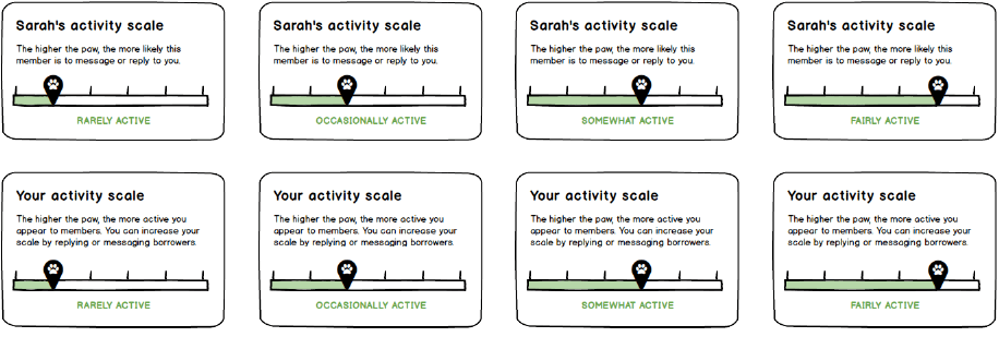
One of the feature ideas that I generated from this hypothesis was an activity scale that would highlight how active a user was; setting up the potential match with a clear indication of whether it worth investing time reaching out to a member and how likely the recipient is to reply. This pattern is seen across dating sites and other messaging-based platforms and seemed a good fit to solve the problem with little cognitive load, given the familiarity for many users.
A feature designed to work alongside the activity scale was the 'Seeking Status' indicator. This allows owners and borrowers alike to set their current preference for finding a match by prompting them to display a status message to others if they are currently looking for a match or not. Adding this simple addition to a user profile helped set an expectation and stopped users messaging unavailable users.


Creating the canine council
I began holding regular user feedback sessions with some of our most engaged customers, something I came to call our 'Canine Council'. By involving this ideal cohort of users, we could get quick and helpful feedback on the product directly from the people who know it best.
These council events would involve a split of owners and borrowers, usually held in the BorrowMyDoggy office and apply a range of user research techniques like card sorting, usability testing and individual interviews to review a new feature.
In addition to the wealth of feedback from customers, these sessions were a powerful way to involve the broader BorrowMyDoggy team in the product design process. Getting a rotating roster of members from across the business to run sessions alongside my design activities helped build a test and learn the culture that carries on to this day.
The activity scale and status indicator were two features presented during one of these sessions, receiving positive feedback and helpful suggestions that would prove worthwhile. The activity scale imparticular required an in-depth session with users to ensure the language was as straightforward as possible.
After design iterations complete and features launched, both activity scale and status indicators received a positive response from users and resulted in a sizeable increase in message response rate. Within two weeks of launching the status indicator, over 85% of users had added a seeking status to their profile.
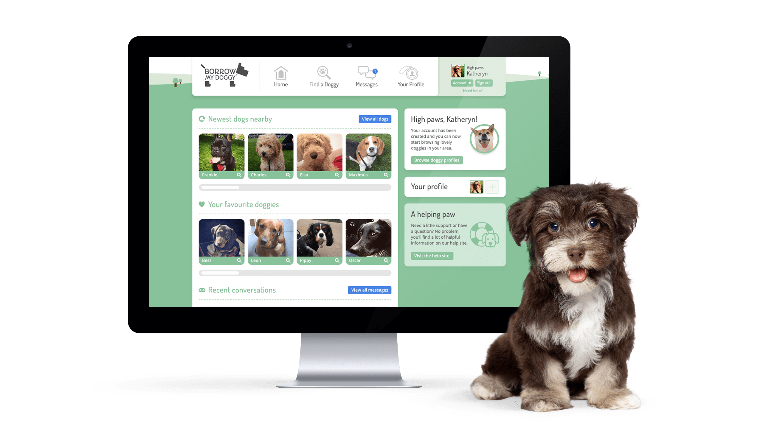
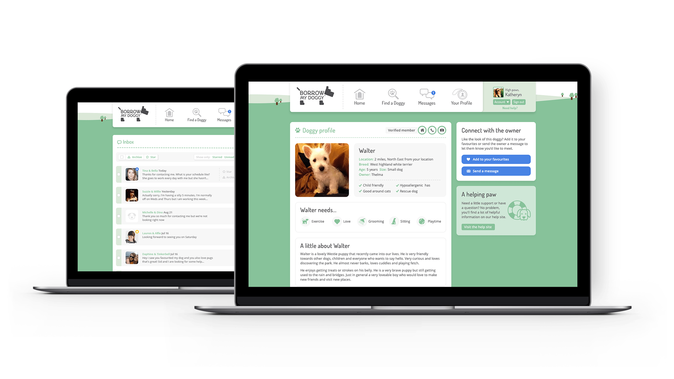
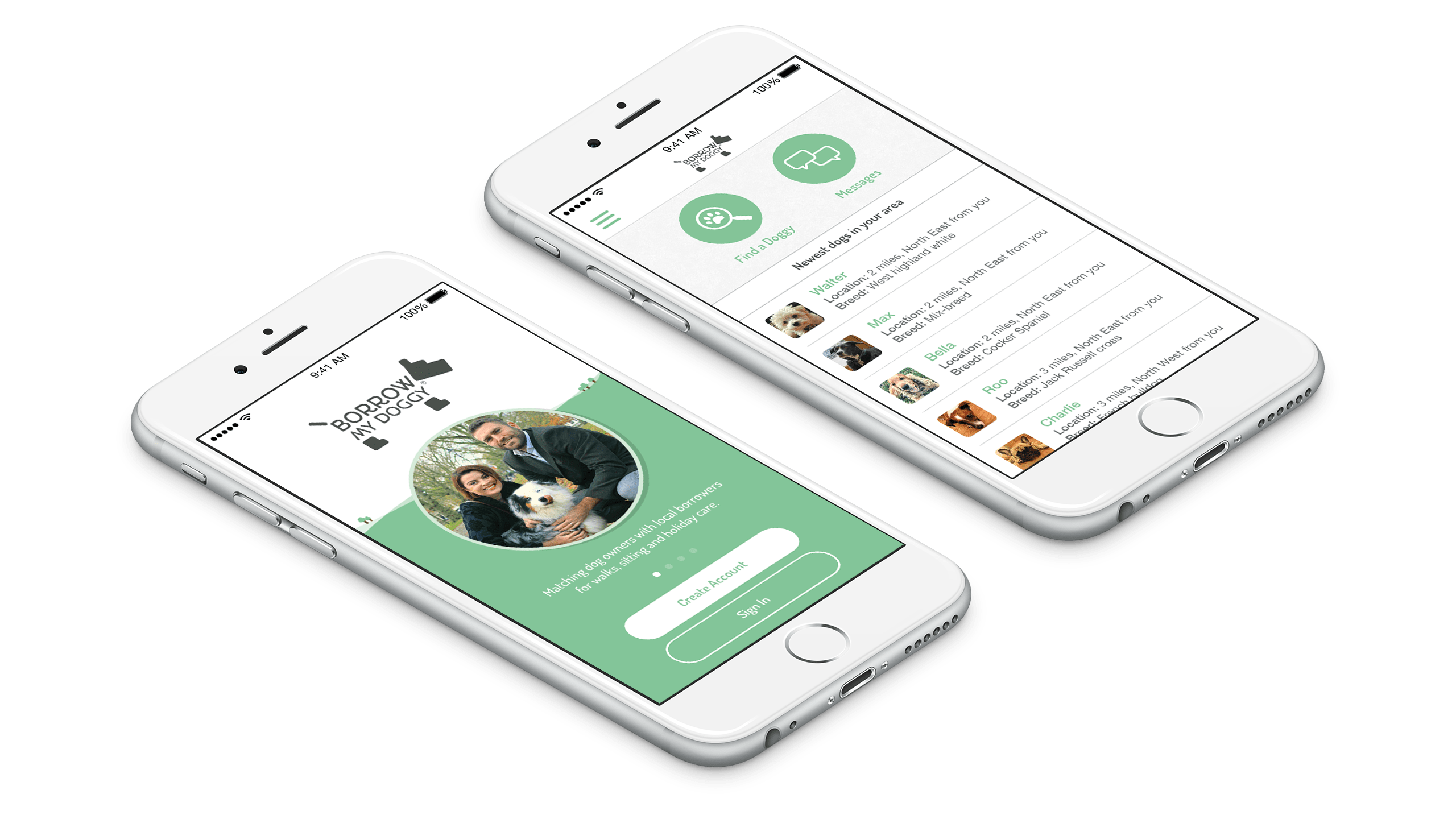
In addition to feature ideation and implementation, I also lead the entire product suite's redesign during my time at BorrowMyDoggy, including redesigning the companion iOS app and creating an adaptable design system that is still in use today.
